
Let's do some magic with CSS grids.
Journey to Responsive Web development

I am a developer from Nepal who is primarily focused on Frontend Web development and loves exploring python.
Let's make a skeleton for our card first:
<head>
 <meta name="viewport" content="width=device-width, initial-scale=1.0">
</head>
<body>
<div class="cards-container">
   <div class="card">
    <img src="https://cdn.pixabay.com/photo/2021/07/26/14/30/woman-6494461_960_720.jpg" alt="woman-6494461_960_720">
    <div class="informations">
     <h2>Power of CSS</h2>
     <p>Lorem ipsum, dolor sit amet consectetur adipisicing elit. Quae sunt aliquam amet incidunt consequatur possimus,
      ratione ducimus unde doloremque eos est, provident veritatis, voluptates commodi molestiae dolor cupiditate sit
      libero.</p>
     <button>Click Me! </button>
    </div>
   </div>
  </div>
</body>
CSS code for now:
* {
  box-sizing: border-box;
  margin: 0;
  padding: 0;
}
body {
  width: 100%;
}
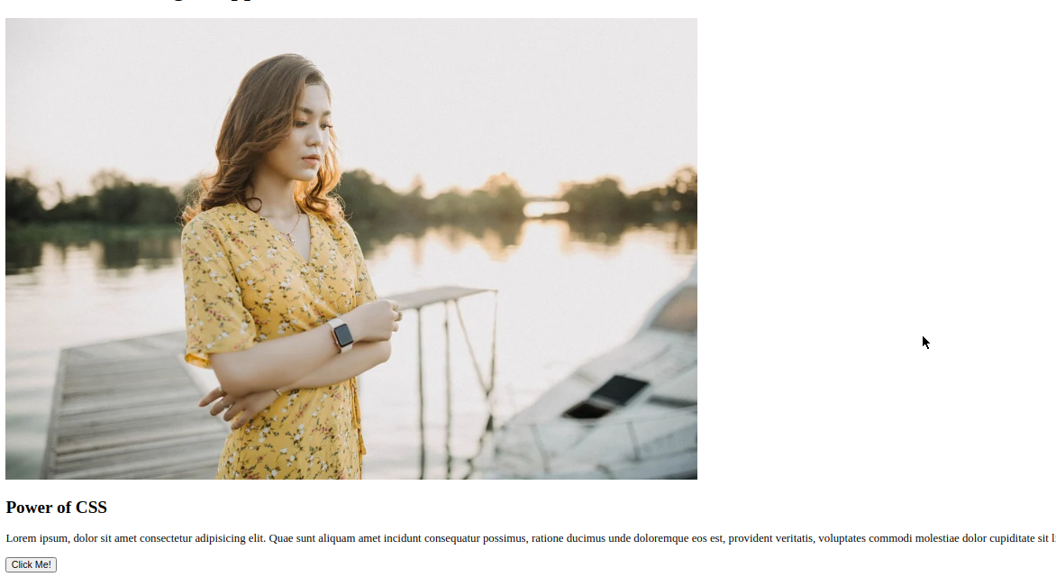
Progress till now would be like this:
Now, let us copy the card div 3 times which will make the page more ugly 😜 but we will add some magic soon.
Now, we have four cards. It's time to make the magic happen. Let's add the display: grid property to the div which is wrapping those four cards i.e cards-container which will make it support other properties of the grid. Now, for showing all those cards in one row, we could do grid-template-column: repeat(4, 1fr) which means adding 4 columns in each row. Now, let's give img width of 100% width:100%; so that it won't stretch out. Now, our CSS code will be like this:
* {
  box-sizing: border-box;
  margin: 0;
  padding: 0;
}
body {
  width: 100%;
}
.cards-container {
  display: grid;
  grid-template-columns: repeat(4, 1fr);
}
.card img {
  width: 100%;
  object-fit: cover; // it will make image coverup the free spaces without streching itself.
}
And its output would be like:
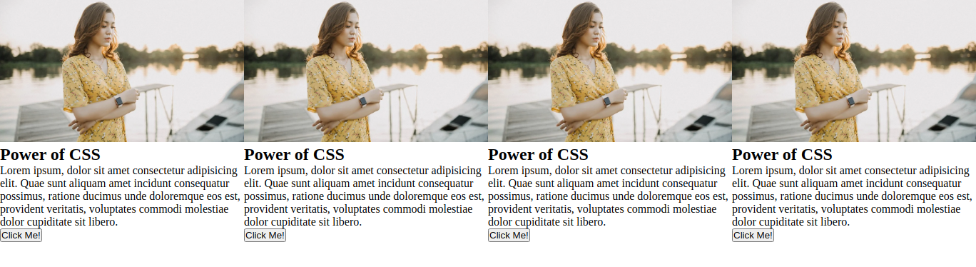 See how the cards are automatically aligned and fitted in one line. Now, to give some spaces in between cards, we have properties called
 grid-row-gap, grid-column-gap, and grid-gap for giving spaces in between rows, columns, and both respectively. For now, let's add grid-gap: 32px and padding:16px inside .cards-container to give some spaces.
// css except for body
.cards-container {
  display: grid;
  grid-template-columns: repeat(4, 1fr);
  grid-gap: 32px;
  padding: 16px;
}
.card img {
  width: 100%;
  object-fit: cover;
}
And the result would look like this,
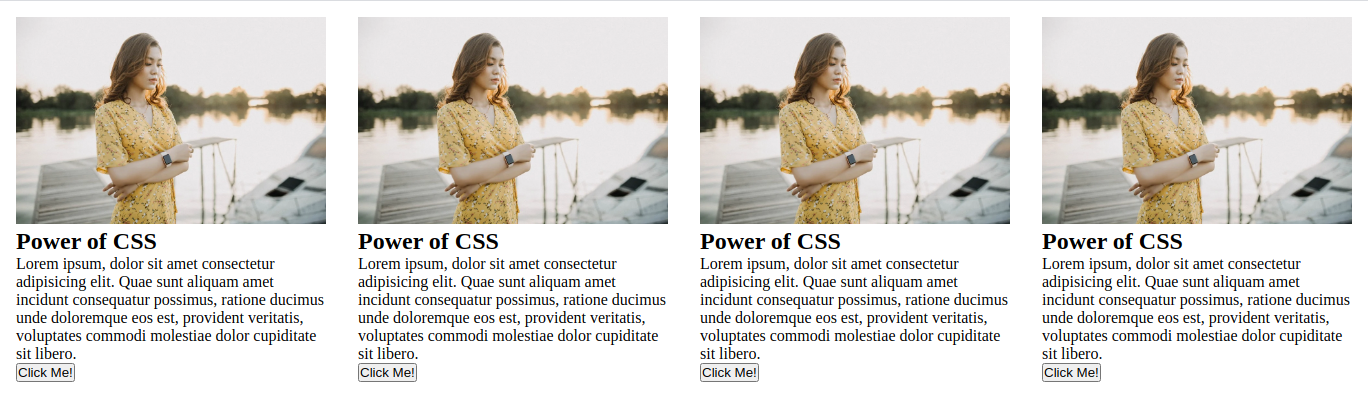 We can now add media queries to make it responsive by just changing the value of
 grid-template-columns for different viewport widths. If you are new to media queries see media queries which explains the basics of using media queries for different screen sizes.
CSS for media queries would be:
@media screen and (max-width: 900px) {
  .cards-container {
    grid-template-columns: repeat(3, 1fr);
  }
}
@media screen and (max-width: 650px) {
  .cards-container {
    grid-template-columns: repeat(2, 1fr);
  }
}
@media screen and (max-width: 480px) {
  .cards-container {
    grid-template-columns: repeat(1, 1fr);
  }
}
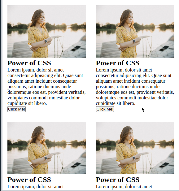
Now, it should show the different numbers of cards for different screen sizes. For viewport width between 480px and 650px it should show two cards in a row like:
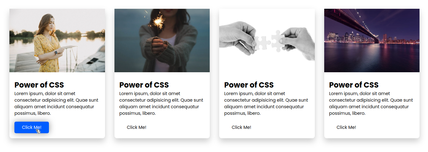
 Congrats 🎉, You have now learned to do basic CSS magic combined with media queries to make it responsive. Now, we can customize the cards according to need. Here's my final page:
 My HTML Code:
<!DOCTYPE html>
<html lang="en">

<head>
 <meta name="viewport" content="width=device-width, initial-scale=1.0">
 <link rel="stylesheet" type="text/css" href="simple_grid.css">
 <title>Simple grid</title>
</head>

<body>
 <div class="cards-container">
  <div class="card">
   <img src="https://cdn.pixabay.com/photo/2021/07/26/14/30/woman-6494461_960_720.jpg" alt="woman-6494461_960_720">
   <div class="informations">
    <h2>Power of CSS</h2>
    <p>Lorem ipsum, dolor sit amet consectetur adipisicing elit. Quae sunt aliquam amet incidunt consequatur possimus,
     libero.</p>
    <button>Click Me! </button>
   </div>
  </div>
  <div class="card">
   <img src="https://cdn.pixabay.com/photo/2015/03/17/14/05/sparkler-677774_960_720.jpg" alt="sparkler-677774_960_720">
   <div class="informations">
    <h2>Power of CSS</h2>
    <p>Lorem ipsum, dolor sit amet consectetur adipisicing elit. Quae sunt aliquam amet incidunt consequatur possimus,
     libero.</p>
    <button>Click Me! </button>
   </div>
  </div>
  <div class="card">
   <img src="https://cdn.pixabay.com/photo/2012/03/01/01/42/hands-20333_960_720.jpg" alt="hands-20333_960_720">
   <div class="informations">
    <h2>Power of CSS</h2>
    <p>Lorem ipsum, dolor sit amet consectetur adipisicing elit. Quae sunt aliquam amet incidunt consequatur possimus,
     libero.</p>
    <button>Click Me! </button>
   </div>
  </div>
  <div class="card">
   <img src="https://cdn.pixabay.com/photo/2014/05/02/23/46/bridge-336475_960_720.jpg" alt="bridge-336475_960_720">
   <div class="informations">
    <h2>Power of CSS</h2>
    <p>Lorem ipsum, dolor sit amet consectetur adipisicing elit. Quae sunt aliquam amet incidunt consequatur possimus,
     libero.</p>
    <button>Click Me! </button>
   </div>
  </div>
 </div>
</body>

</html>
CSS Code:
@import url('https://fonts.googleapis.com/css2?family=Poppins:wght@200;300;400;500;600;700&display=swap');
* {
  box-sizing: border-box;
  margin: 0;
  padding: 0;
  font-family: 'Poppins', sans-serif;
  transition: all 0.3s ease-in-out;
}
body {
  width: 100%;
}
.cards-container {
  display: grid;
  grid-template-columns: repeat(4, 1fr);
  grid-gap: 30px;
  padding: 30px;
}
.card {
  border-radius: 8px;
  box-shadow: 0 10px 20px rgba(196, 196, 196, 0.86);
}
.informations {
  padding: 16px;
}

p {
  margin-bottom: 1rem;
  font-size: 14px;
}
button {
  padding: 0.5rem 1.5rem;
  border: none;
  outline: none;
  background-color: #fff;
  border-radius: 5px;
  font-size: 14px;
  cursor: pointer;
}
button:hover {
  background-color: #005dff;
  color: #fff;
}
.card:hover button {
  box-shadow: 0 0px 20px rgba(128, 128, 128, 0.86);
}
.card img {
  width: 100%;
  object-fit: cover;
}
@media screen and (max-width: 900px) {
  .cards-container {
    grid-template-columns: repeat(3, 1fr);
  }
}
@media screen and (max-width: 650px) {
  .cards-container {
    grid-template-columns: repeat(2, 1fr);
  }
}
@media screen and (max-width: 480px) {
  .cards-container {
    grid-template-columns: repeat(1, 1fr);
  }
}
Edits:
Now, let's do another cool thing which would use the full potential of CSS Grid after this we won't need to add media queries to make it responsive. First, let's cleanup the media queries. Now, instead of doing grid-template-columns: repeat(4, 1fr); we simple do grid-template-columns: repeat(auto-fit, minmax(250px, 1fr)); inside.cards-container and the code for.cards-container would look like this:
  display: grid;
  grid-template-columns: repeat(auto-fit, minmax(250px, 1fr));
  grid-gap: 30px;
  padding: 30px;
auto-fit fits the currently available cards into the free space by expanding them. minmax(250px, 1fr) is the key which helps us in responsiveness. What is does is, it breaks down the card columns, make one more row and send them into that row whenever the card size becomes less than 250px. Now, the final css code will look like:
@import url('https://fonts.googleapis.com/css2?family=Poppins:wght@200;300;400;500;600;700&display=swap');
* {
  box-sizing: border-box;
  margin: 0;
  padding: 0;
  font-family: 'Poppins', sans-serif;
  transition: all 0.3s ease-in-out;
}
body {
  width: 100%;
}
h1 {
  text-align: center;
  margin-top: 2rem;
}
.cards-container {
  display: grid;
  grid-template-columns: repeat(auto-fill, minmax(250px, 1fr));
  grid-gap: 30px;
  padding: 30px;
}
.card {
  border-radius: 8px;
  box-shadow: 0 10px 20px rgba(196, 196, 196, 0.86);
}
.informations {
  padding: 16px;
}

p {
  margin-bottom: 1rem;
  font-size: 14px;
}
button {
  padding: 0.5rem 1.5rem;
  border: none;
  outline: none;
  background-color: #fff;
  border-radius: 5px;
  font-size: 14px;
  cursor: pointer;
}
button:hover {
  background-color: #005dff;
  color: #fff;
}
.card:hover button {
  box-shadow: 0 0px 20px rgba(128, 128, 128, 0.86);
}
.card img {
  width: 100%;
  object-fit: cover;
}
I hope you enjoyed making these cards. Soon I will be writing on how to make complex layouts like in an e-commerce site or new portal site. Let me know, how my write was and also suggest to me if I should use SCSS in tutorials like these because I prefer writing CSS in SCSS.


